All work

Dabei!

An app that helps people find their way into volunteering.

Try the prototype
Product
Mobile app
Role
Product Designer
Timeline
June to October 2026
Context
Digitale Leute Product Design Bootcamp
Tools
Figma, Miro, ChatGPT, Claude, Perplexity, NotebookLM

01Project scope

01

Discover

  • Desk research
  • Competitor analysis
  • User interviews
  • Survey research
02

Define

  • Segmentation
  • Primary persona
  • Problem statement
  • How might we question
03

Design

  • Information architecture
  • User flows
  • Wireframing: lo-fi, mid-fi, hi-fi
  • Prototyping
  • Design system
04

Test and iterate

  • Usability testing
  • Design iterations
  • Final prototype

02Problem and solution

The problem

Many people can imagine volunteering but hesitate to reach out, because they can’t tell what exactly to expect.

The solution

An app that helps people feel well informed and confident enough before the first contact to make a conscious decision.

03Research

Interest was there. Clarity was not.

I combined a survey, interviews and a competitor analysis to understand where people hesitate.

External research

 41%*of people in Germany can imagine volunteering
 66%*of young adults can imagine volunteering

Own research

Survey · 16 of 2176%felt poorly informed about tasks and requirements
Interviews4 / 5confirmed these uncertainties

* Source: German Survey on Volunteering 2024 (Freiwilligensurvey 2024).

In their own words · interviews

Vague tasks

»There was a lot about how important the project is, but surprisingly little about what my task would be.«

Tobias, 32, developer
Unclear fit

»I don’t even know if I’m good enough for it. Whether I could really help, or would just end up getting in the way.«

Sophie, 22, student
Unknown commitment

»I do want to get involved, but I don’t want to feel like I’ve committed to every Tuesday for the next two years.«

Markus, 41, master craftsman
Hard to scan

»At some point I just scrolled past it, because there was so much and I couldn’t find the information I was looking for.«

Lena, 27, marketing professional

Three recurring frictions

  • 01Vague tasks
  • 02Unclear fit
  • 03Unknown commitment

Competitor analysis · existing platforms

  • Inconsistent profiles
  • Information that is hard to scan
  • A pushy »get involved« call to action
  • Account barriers

My research pointed to an information gap rather than a lack of interest.

04Persona

Portrait of Nina, the primary persona
Primary persona

Nina

»I need to know what I’m getting myself into. How much time does it take, what would I actually do and can I even do it?«
Pain points
  • Unclear tasks and requirements
  • Doubts about her own suitability
  • Difficulty estimating the time commitment
Need & goal

Clarity

How might we

How can we provide Nina with enough clarity about what is expected of her before she decides to contact an organization?

05Decision journey and wireframes

Save to favorites OPTIONAL Self-check OPTIONAL 01 Setup Place and preferences, set once 02 Discover Card stack, adjustable filters 03 Detail Standardized information per opportunity 04 Contact No account needed Does this opportunity fit me? YES Message sent NO Look at more opportunities or adjust the filters

Wireframes of the core journey

Wireframe: Setup
01Setup
Wireframe: Discover
02Discover
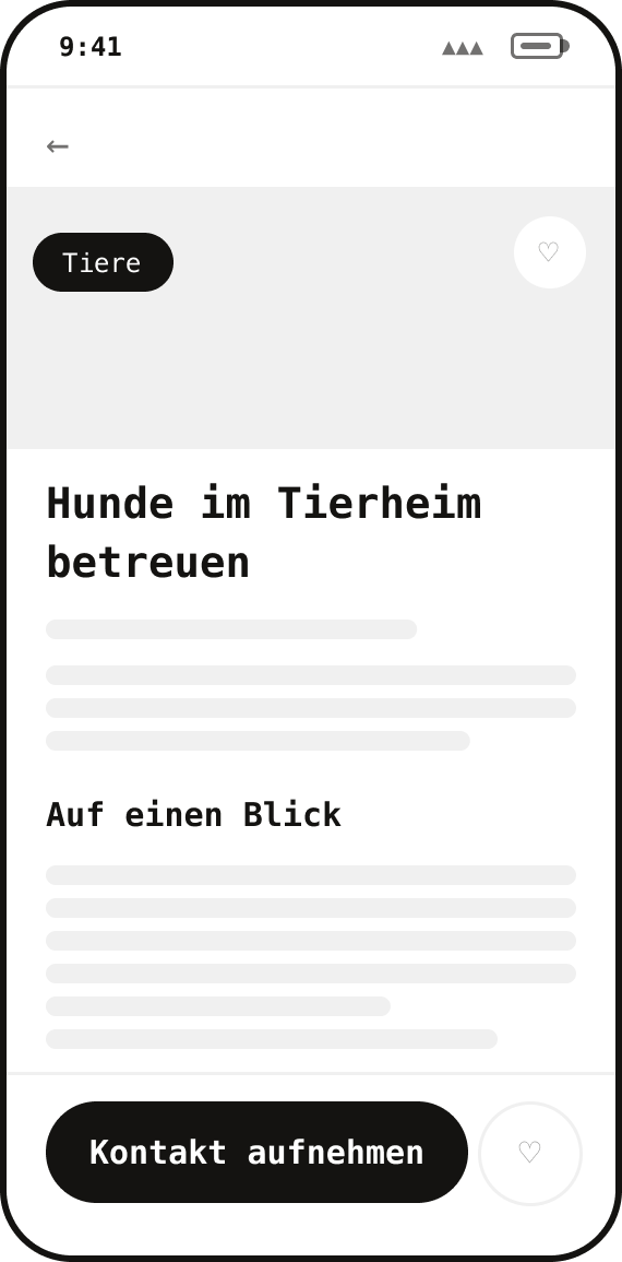
Wireframe: Detail
03Detail
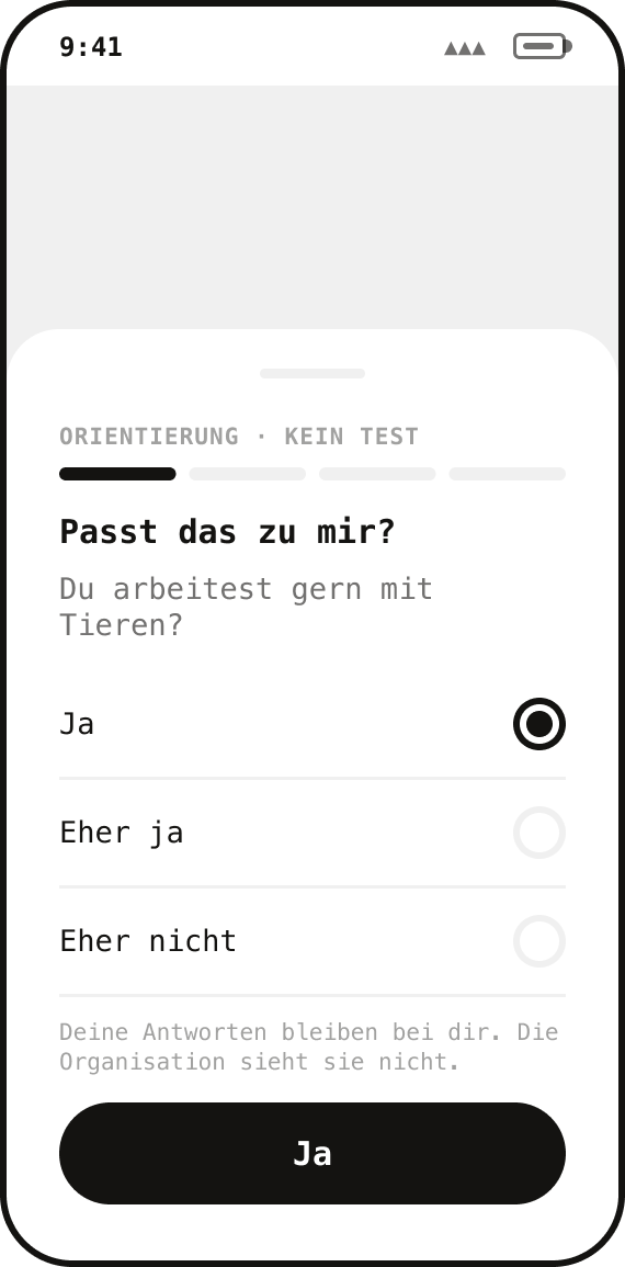
Wireframe: Self-check
04Self-check
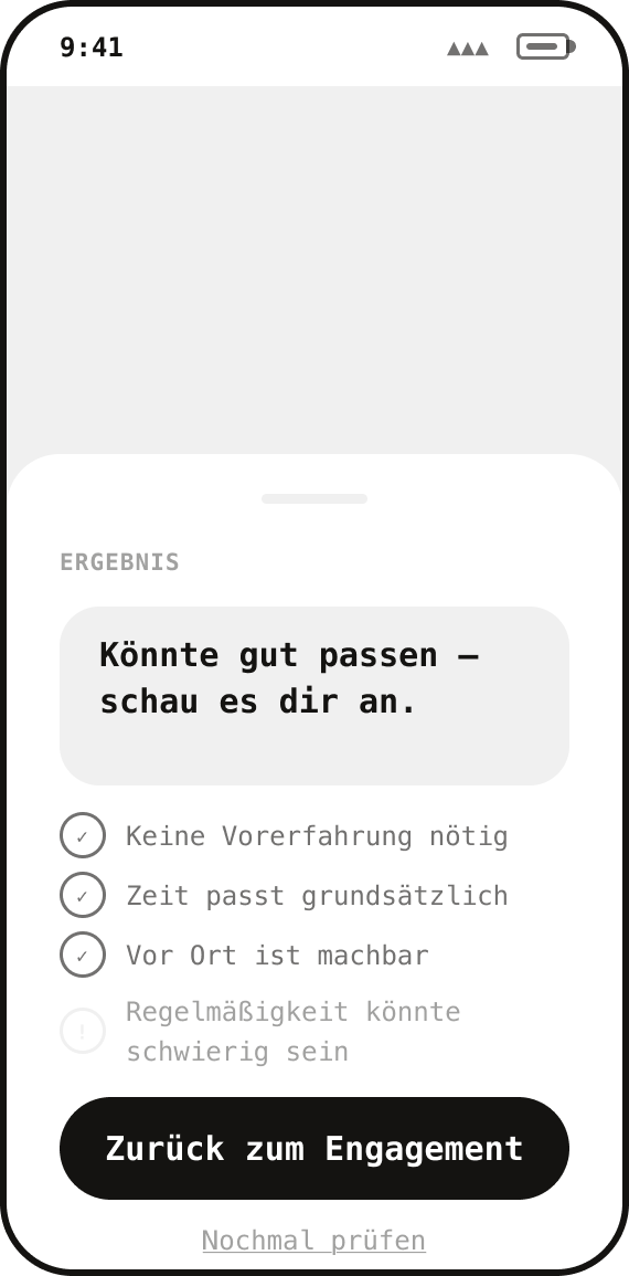
Wireframe: Self-check result
05Self-check result
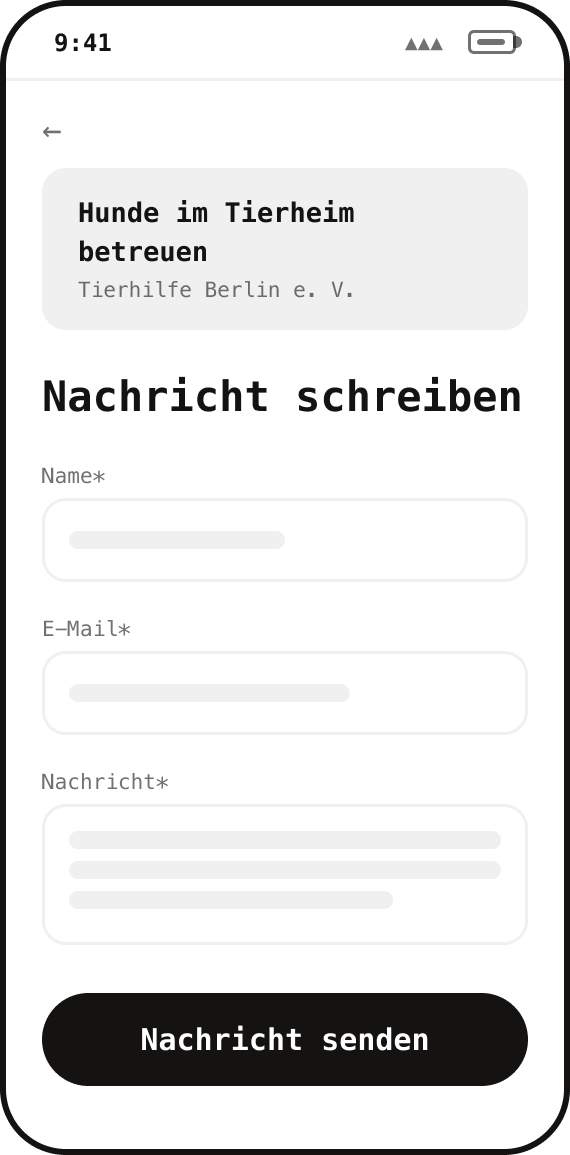
Wireframe: Contact
06Contact
Wireframe: Message sent
07Message sent

The wireframes deliberately contained more copy than usual, so the user flow and information architecture could already be tested at this stage.

06What shaped the product

Problem, decision, interface.

Eight decisions made the biggest difference.

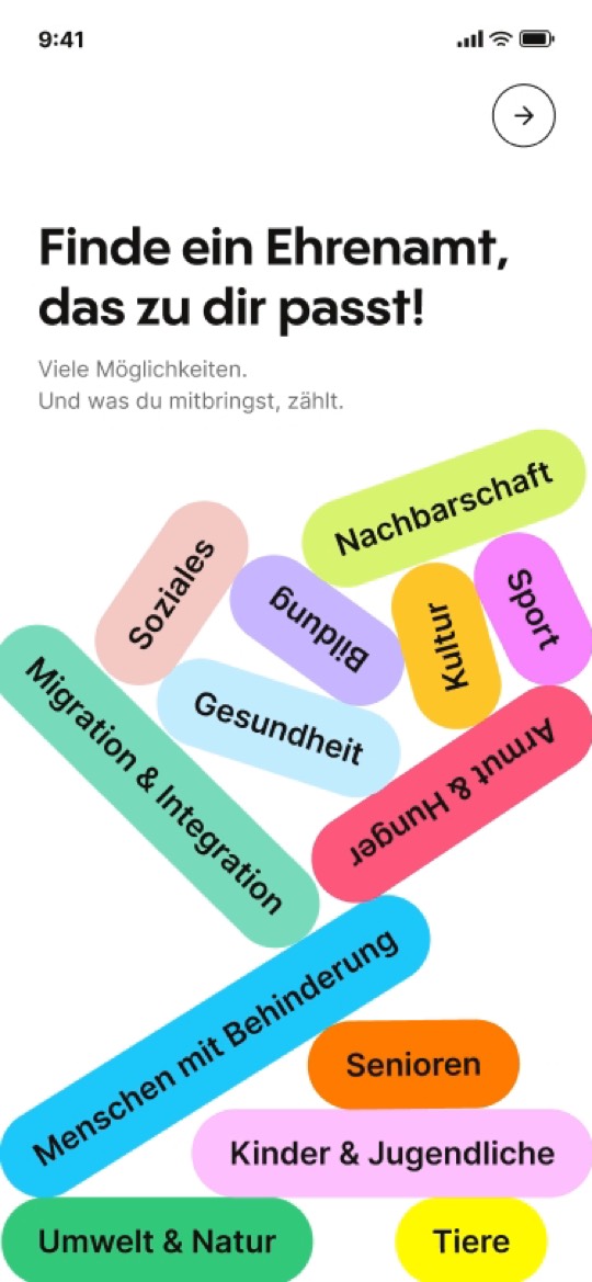
01A playful first impression

  • TestingThe journey needed a clearer beginning.
  • DecisionAn animated intro playfully introduces all areas in their colors before asking any questions.
  • Visual conceptEvery area has its own color, introduced here and carried through the app.
  • Why it mattersColor becomes part of the information architecture: areas are quick to recognize.

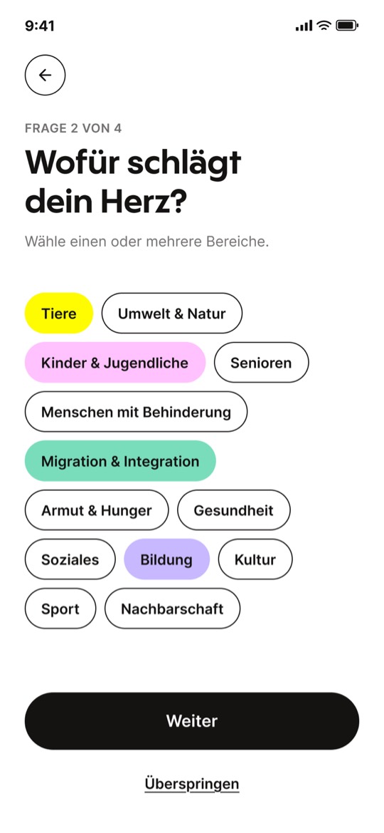
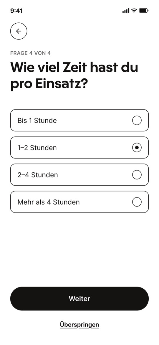
02A guided start

  • DecisionFour quick questions about place, area, rhythm and time, one per screen and each skippable.
  • Why it mattersDiscover starts with relevant opportunities, and setup stays a light first step instead of a form.

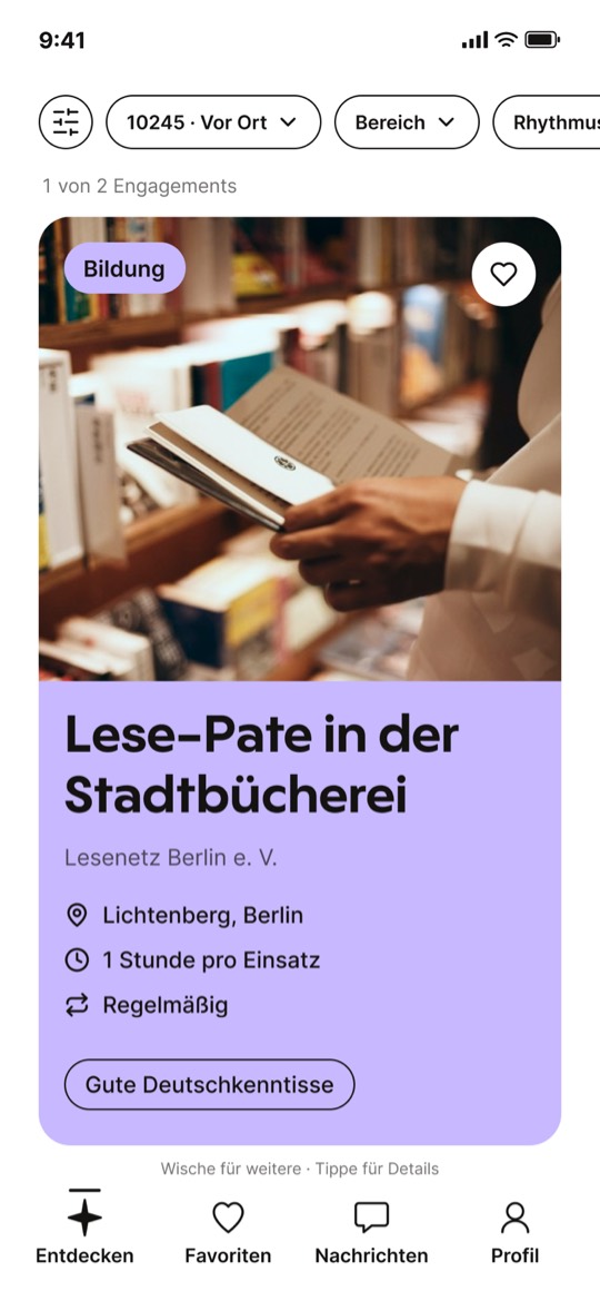
03One opportunity at a time

  • Research / problemToo much information can make the first relevance check harder.
  • DecisionDeliberately avoid a list view: each card asks for a conscious relevance decision instead of side-by-side comparison. The detail page supports a closer assessment.

04Filters that stay adjustable

  • ProblemThe first setup choices might not match every later search.
  • DecisionLet people refine the area or revisit their place, rhythm and time preferences from Discover.
  • Why it mattersThe search can change without repeating the setup.

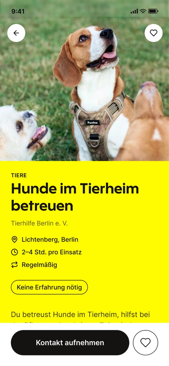
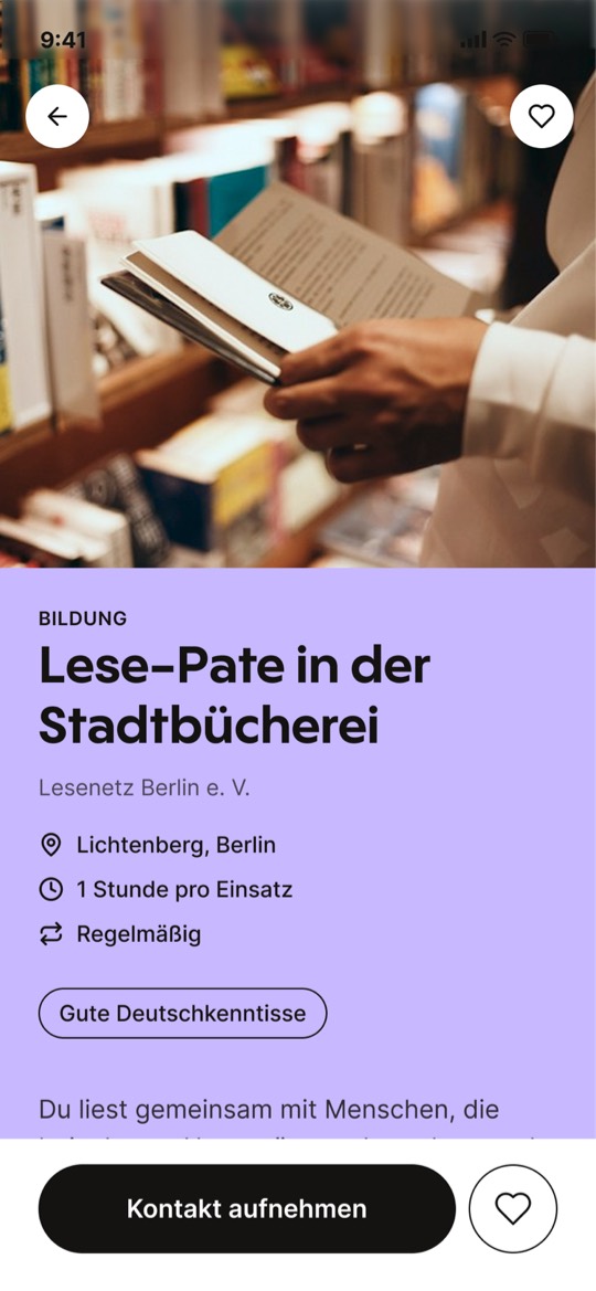
05Standardized opportunity profiles

  • ResearchTasks, requirements and commitment were often unclear.
  • DecisionUse the same required fields for every opportunity. The first profile shows only those fields; the extended version adds more detail and personality without changing the underlying structure.
  • Why it mattersPeople can assess what an opportunity involves before making contact, while richer profiles bring the work to life.

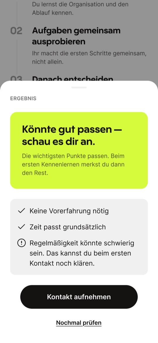
06A self-check before contact

  • ProblemEven after reading a profile, someone may need more reassurance before making contact.
  • DecisionGenerate reflective questions from the profile's required information to help people consider their own fit before reaching out.
  • Why it mattersIt is a self-check, not a test: the result supports reflection and self-assessment without assigning a score.

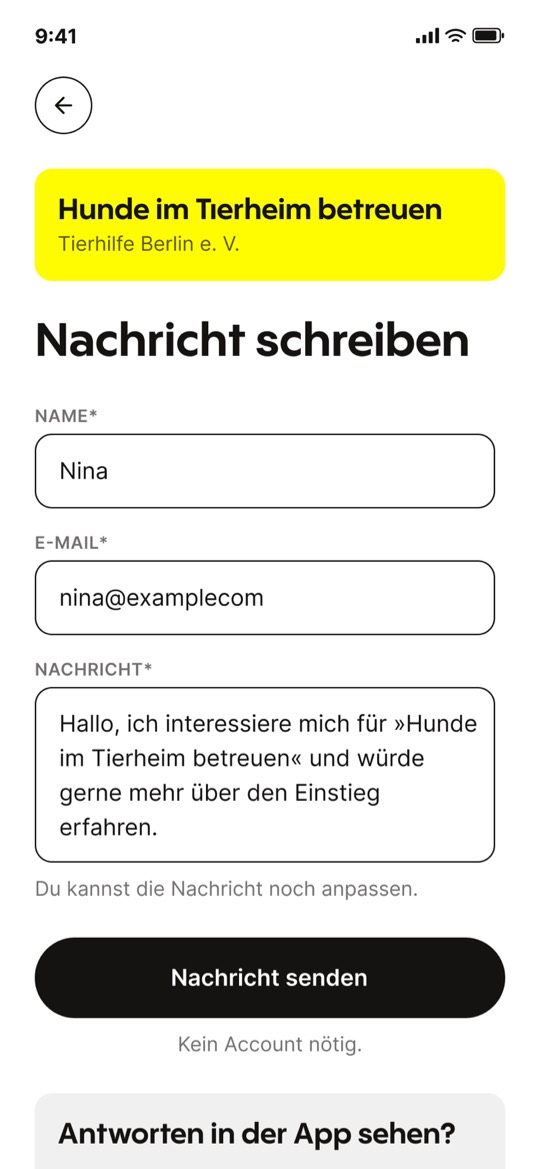
07Contact without an account

  • ProblemMandatory signup adds friction before the first contact.
  • DecisionBefore someone writes or sends a message, the copy makes clear that no account is needed and the reply will arrive by email. A sent-message confirmation closes this low-barrier path.

08An account that stays optional

  • WireframesIn the wireframes, an account was still required to send a message. That stage already made clear it was an unnecessary barrier, so I changed it.
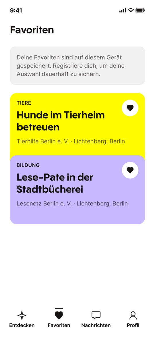
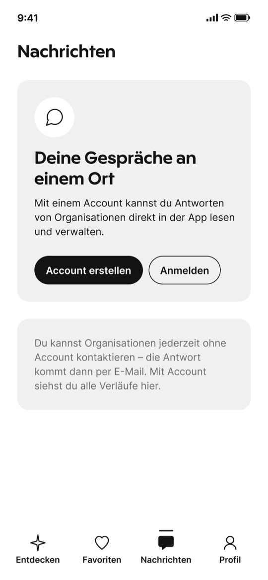
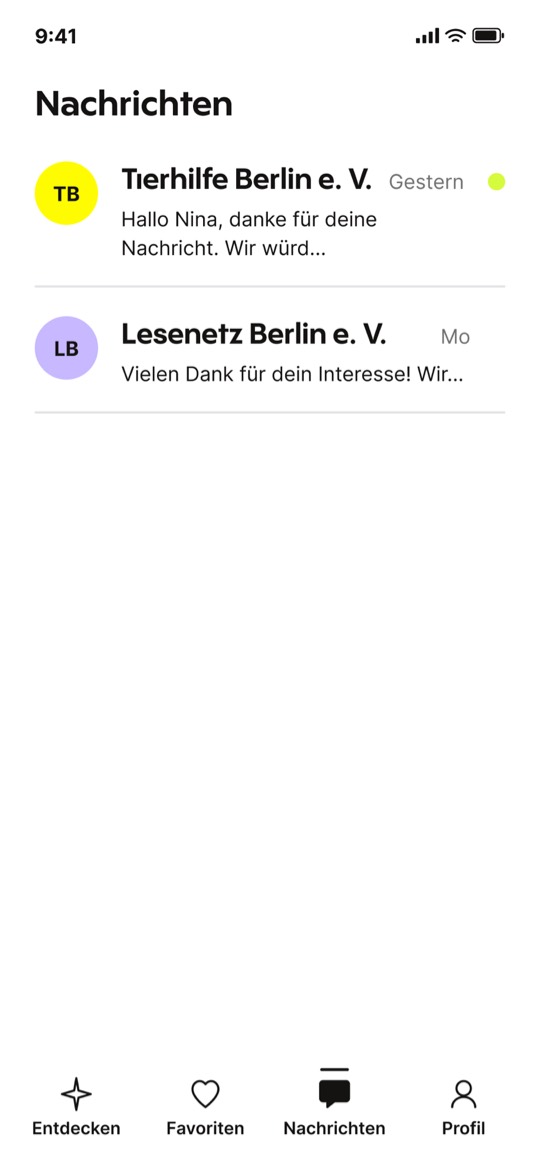
  • DecisionEverything works without an account. Creating one keeps favorites and replies together in the app.
  • Why it mattersDiscover and contact stay open to everyone, and the account becomes a benefit instead of a barrier.

07Testing and iteration

The structure held. The transitions did not.

4participants
3tasks
5hypotheses tested
2design iterations

In their own words · usability tests

Optional account

»I get what the account would be useful for, but I like that it’s just there as an option. I don’t feel pushed to sign up.«

Usability test
Transition

»Oh, okay, that was a bit sudden. For a moment I was like: wait, are these already my results?«

Usability test
Contact without an account

»I like that I can just write and get the answer by email. That makes reaching out feel much less complicated.«

Usability test

Supported

  • Information hierarchy
  • Self-check as orientation
  • Contact without an account
  • Optional account
  • Card-stack navigation

Test findings and changes

Transition

The jump from Setup to Discover felt abrupt; a loading state now bridges the two.

Swipe hint

Three of four participants missed the swipe hint; it now stays until the first swipe.

Animated intro

I added an animated intro before Setup to give the journey a clearer beginning. Category colors introduce the range of volunteering opportunities.

Prototype

Click through the
prototype yourself

The core journey as an interactive Figma prototype, from setup to a sent message.

Open in full screen

Starting the prototype loads it from Figma (USA) and transfers data such as your IP address to Figma. Privacy

08Design system

Color that structures information.

The whole design system follows one goal: presenting information clearly and making it easy to understand.

Color carries meaning, not decoration. Every volunteering area has its own color, used across chips, cards and profile headers to make categories recognizable at a glance. Additional accent colors are defined for the self-check and profile areas, while soft greys are used for empty states and quieter UI surfaces. Black and white form the neutral base and keep the overall hierarchy calm.

Bold headlines, rounded pills and cards and one clear black button per screen make each step easy to scan. A small set of components repeats across all screens, so every new screen already feels familiar.
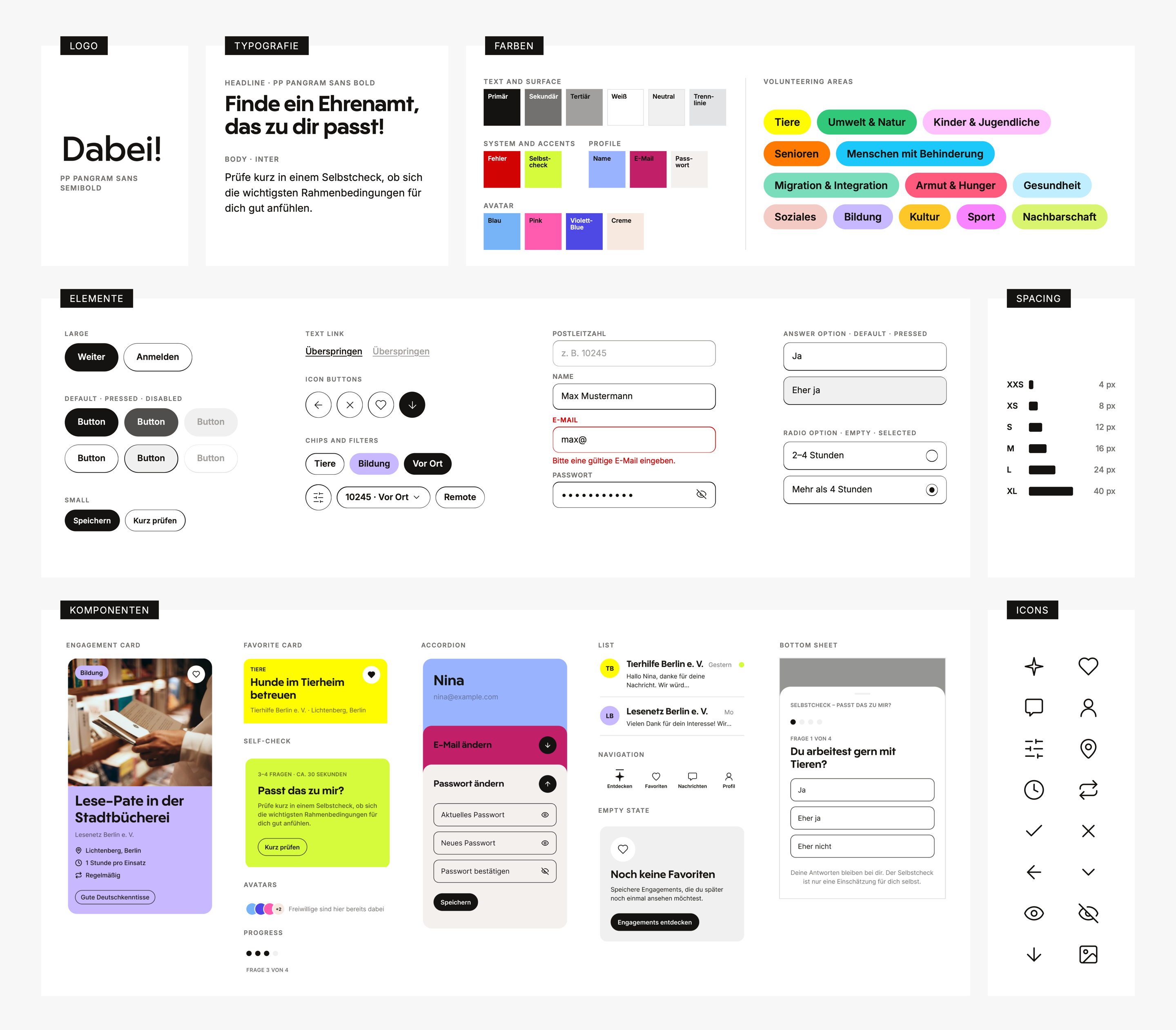
Dabei! design system: typography, colors, spacing, elements and icons

09Measuring success

Primary success metric

Contact conversion rate

The share of people who send a message after viewing an opportunity detail page. The initial target is a 10% improvement once a baseline has been established.

Conversion funnel

  1. Card viewed
  2. Detail opened
  3. Contact started
  4. Message sent

Supporting KPIs

  • Detail view rate
  • Favorite save rate

A/B test

Variant A

Detail view without the self-check

Variant B

Detail view with the self-check

Compared by decision confidence and contact conversion.

10How I used AI

  • Research

    Finding and structuring secondary sources.

  • Ideation

    Expanding the idea pool after exploring ideas independently.

  • Design

    Quickly testing directions and handling smaller design tasks.

  • Critique

    Reviewing and challenging product design decisions.

  • Documentation

    Structuring test scripts, KPI canvases and research documentation.

  • Case Study

    Structuring, condensing and refining the final case study.

11What I learned

  • Structure needs transitions

    What happens between screens matters as much as the screens themselves.

  • Language can absorb uncertainty

    Microcopy was not just an addition but part of the UX. Small hints and clear labels helped manage expectations and make decisions easier.

  • Not every familiar pattern fits

    The account requirement only became an optional benefit after the wireframes. Just because a pattern is familiar doesn’t mean it makes sense in your own product context.

Open to new roles in product and visual design.

Say hello