Jack Rabbit
One-pager for a café and bar on Lake Weissensee
This project was created during my time at 4S Design. It is shown here to document my design contribution. Trademarks, imagery and all further rights of use remain with 4S Design and the respective clients and rights holders.
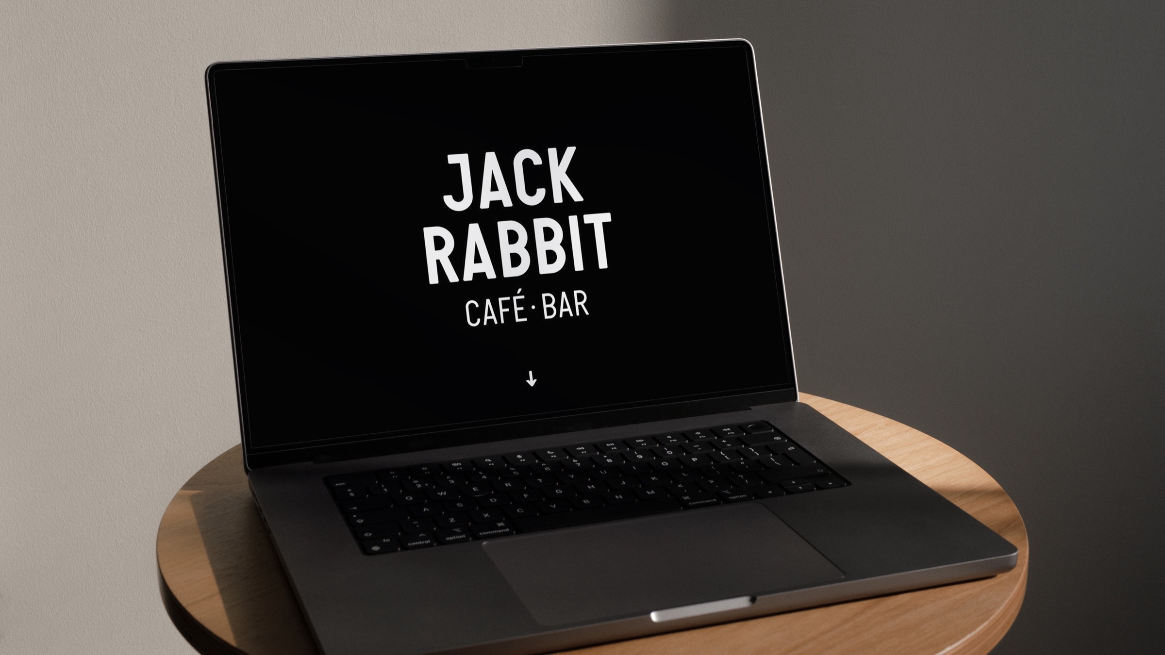



01Overview
One place, two offerings
Jack Rabbit is a café and bar right on Lake Weissensee in Carinthia: coffee by day, cocktails in the evening.
The problem
Guests mainly want to know three things quickly: is it open, where is it and what’s on offer? And that for two offerings in one place: a café by day and a bar in the evening.
The solution
A one-pager that puts the key information and actions right after the intro and opens up the offering through large tiles.
02My role
Concept, web design and UI
I developed the concept, web design and UI of the one-pager. The visual identity, including the logo and the rabbit illustrations, already existed and was not created by me.
03Website


04UX decisions
What shaped the product
A generous opening
After the logo, a large image slider shows the drinks, what’s on offer and the atmosphere.
visitors want to come before they’ve read a word
The essentials first
Opening hours, address, »To the menu« and »Book a table« right after the intro.
the three most common questions are answered at once, which saves phone calls
Always within reach
»To the menu« and »Book a table« sit in the header, which stays fixed while scrolling.
menu and booking always one click away, more bookings
Tiles like beer mats
Square tiles with short, punchy lines lead to café, bar, food, location and events.
five areas at a glance, café and bar both visible at once
Colour only on hover
The page stays black and white; colour appears only on hover.
the page stays calm, the tiles invite exploring
One page, two subpages
Team, the history of the house, the owner’s whiskey book and Instagram on one page; only events and table booking get pages of their own.
short paths: only what needs steps of its own gets a page of its own
These decisions are not backed by user testing. They are based on conversations with the client and on informed assumptions about the target groups’ needs.
05Booking a table
From »Book a table« to confirmation in three steps on a phone: choose the date, party size and seating, pick a time, leave your contact details, no account needed. The confirmation sums everything up and leads straight to the menu.
1 · Home
»Book a table« always at the top
2 · Day
Date, party size and seating
3 · Calendar
Any date until the end of the season
4 · Time
Full hours, booked ones crossed out
5 · Contact
No account, only the essentials
6 · Confirmation
Next step: calendar and menu
06Measuring success
Primary metric · table bookings
Click rate on »Book a table«
How many visitors click »Book a table«.
Hypothesis Guests book more often when opening hours and address come right after the intro and »Book a table« is always within reach in the fixed header (sticky header).
Metric · menu
Bookings after viewing the menu
How many visitors book a table after looking at the menu.
Hypothesis Visitors who have looked at the menu beforehand book a table more often, because they already know what to expect.
Measurement wasn’t part of the project scope; I defined these metrics afterwards. How I would measure: set a baseline first, then compare every change against it.
07Style guide


