R!SE
Digital design and website experience for R!SE Festival by IG Metall Jugend
This project was created during my time at 4S Design. It is shown here to document my design contribution. Trademarks, imagery and all further rights of use remain with 4S Design and the respective clients and rights holders.

01Overview
One festival, three situations
R!SE is the festival of IG Metall Jugend.
The problem
The website has to work in two situations: before the festival, visitors look for tickets and practical information; on the festival grounds, they want to see on their phones what’s on where right now.
The solution
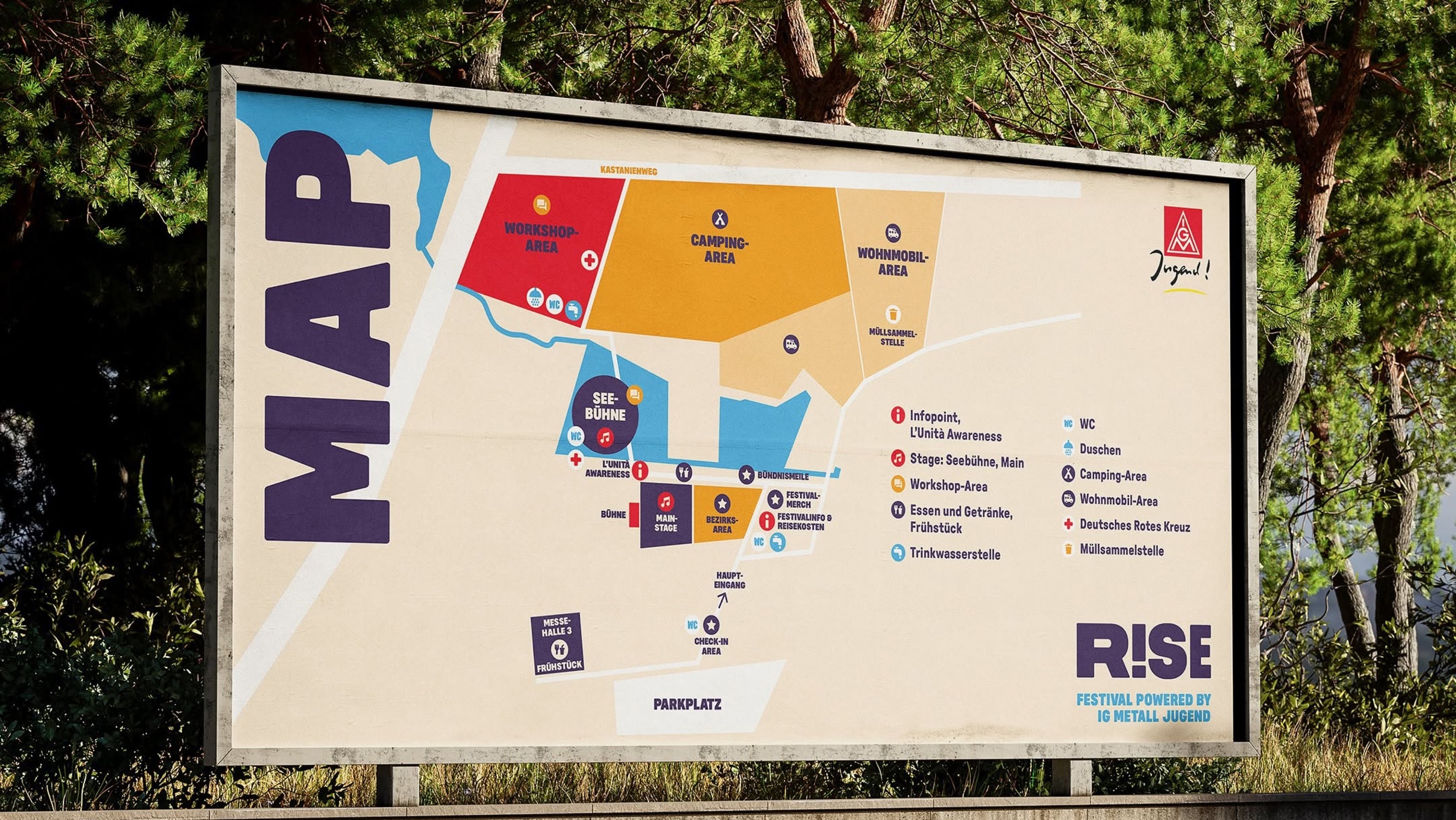
A site built around orientation: the programme as a clear table by day, a map of the grounds and essential information that can be found in seconds, even on a phone.
02My role
From concept to the WordPress build
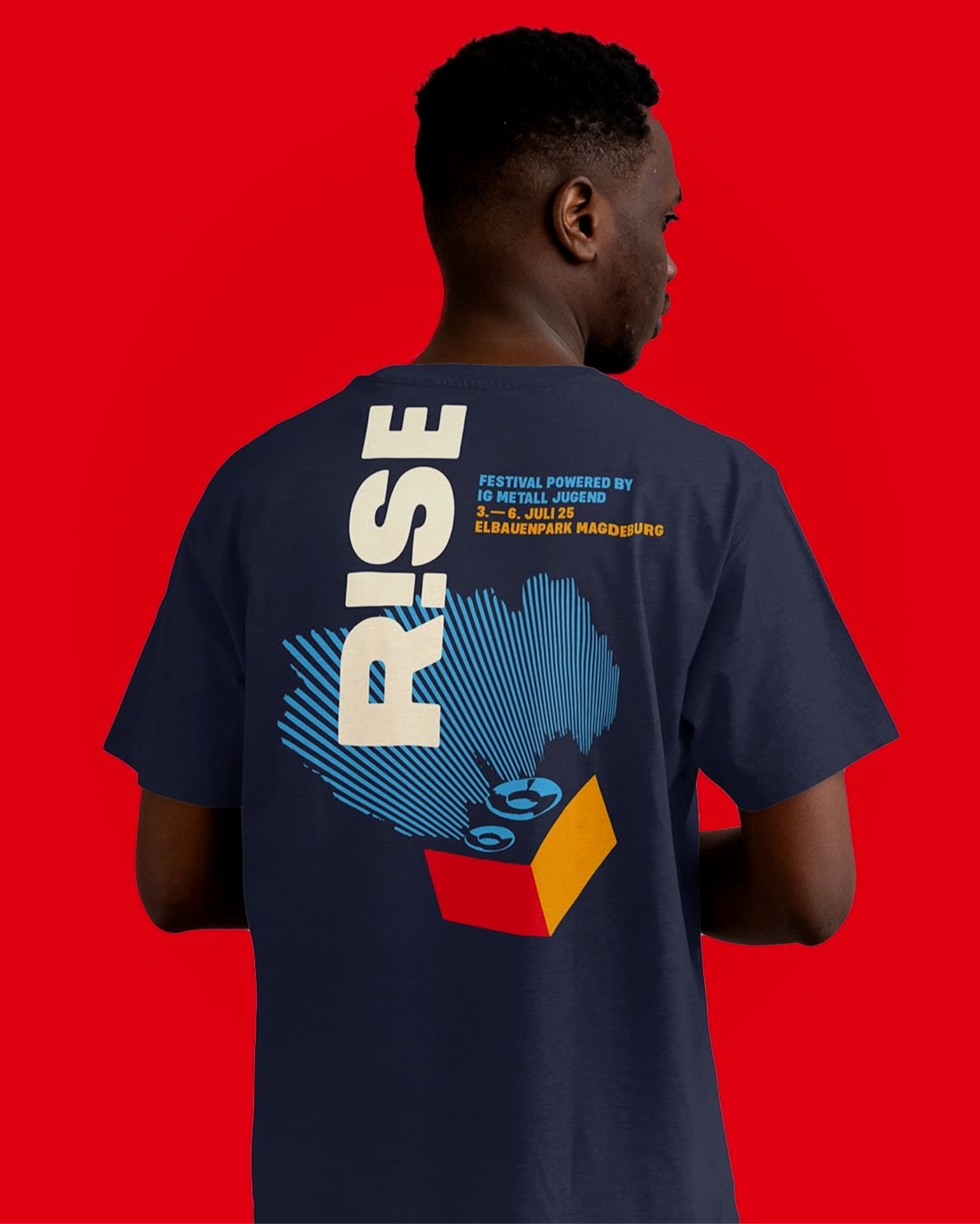
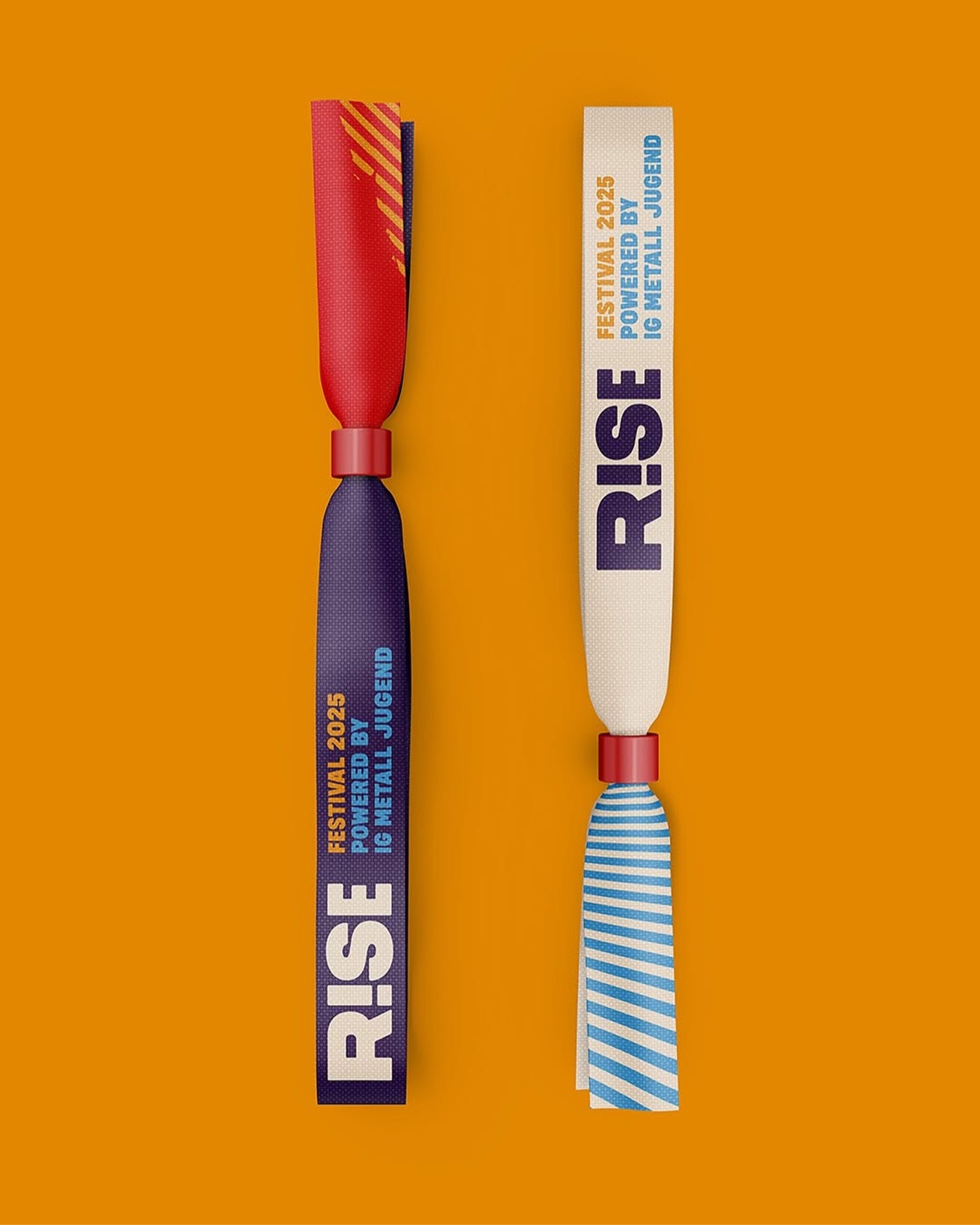
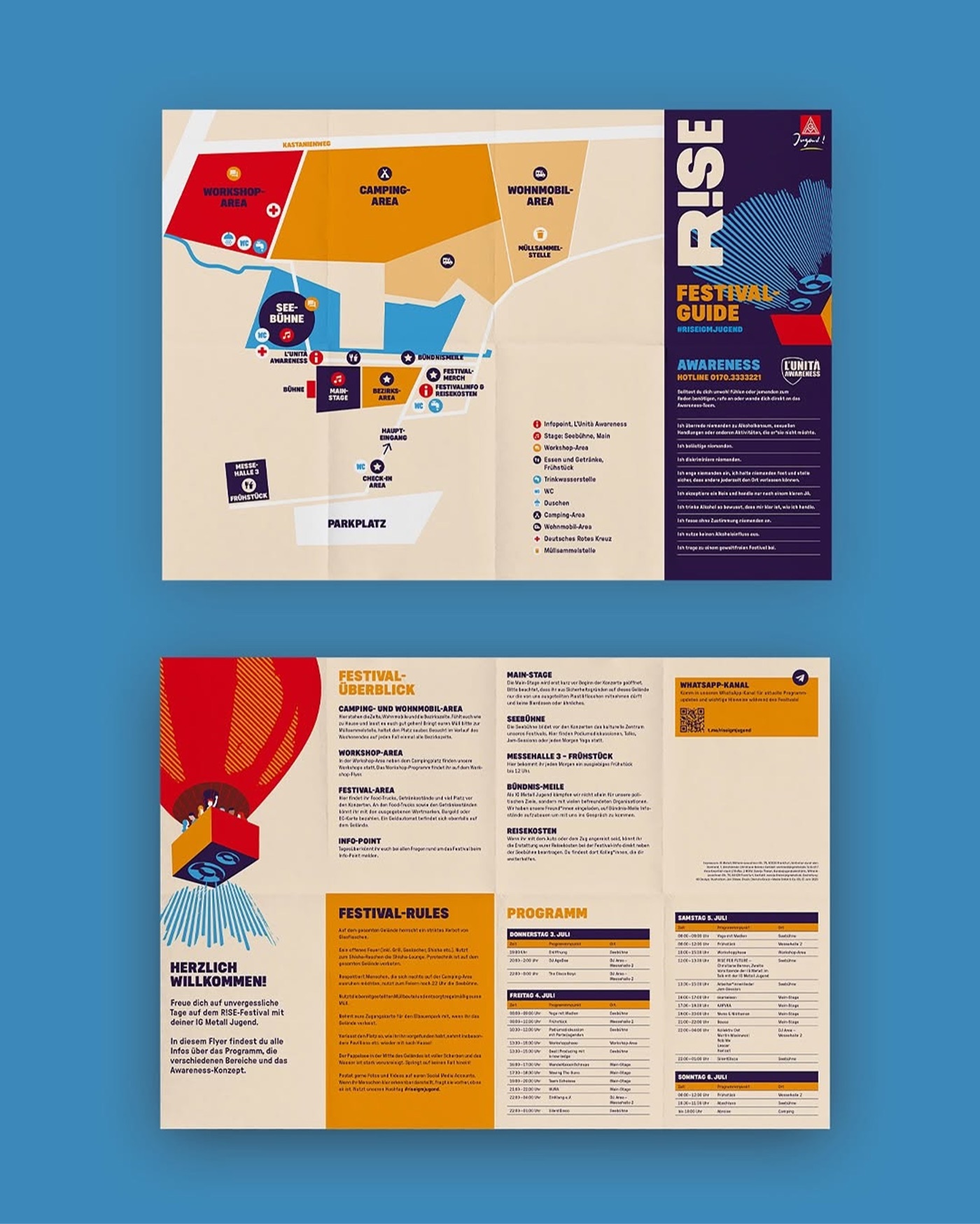
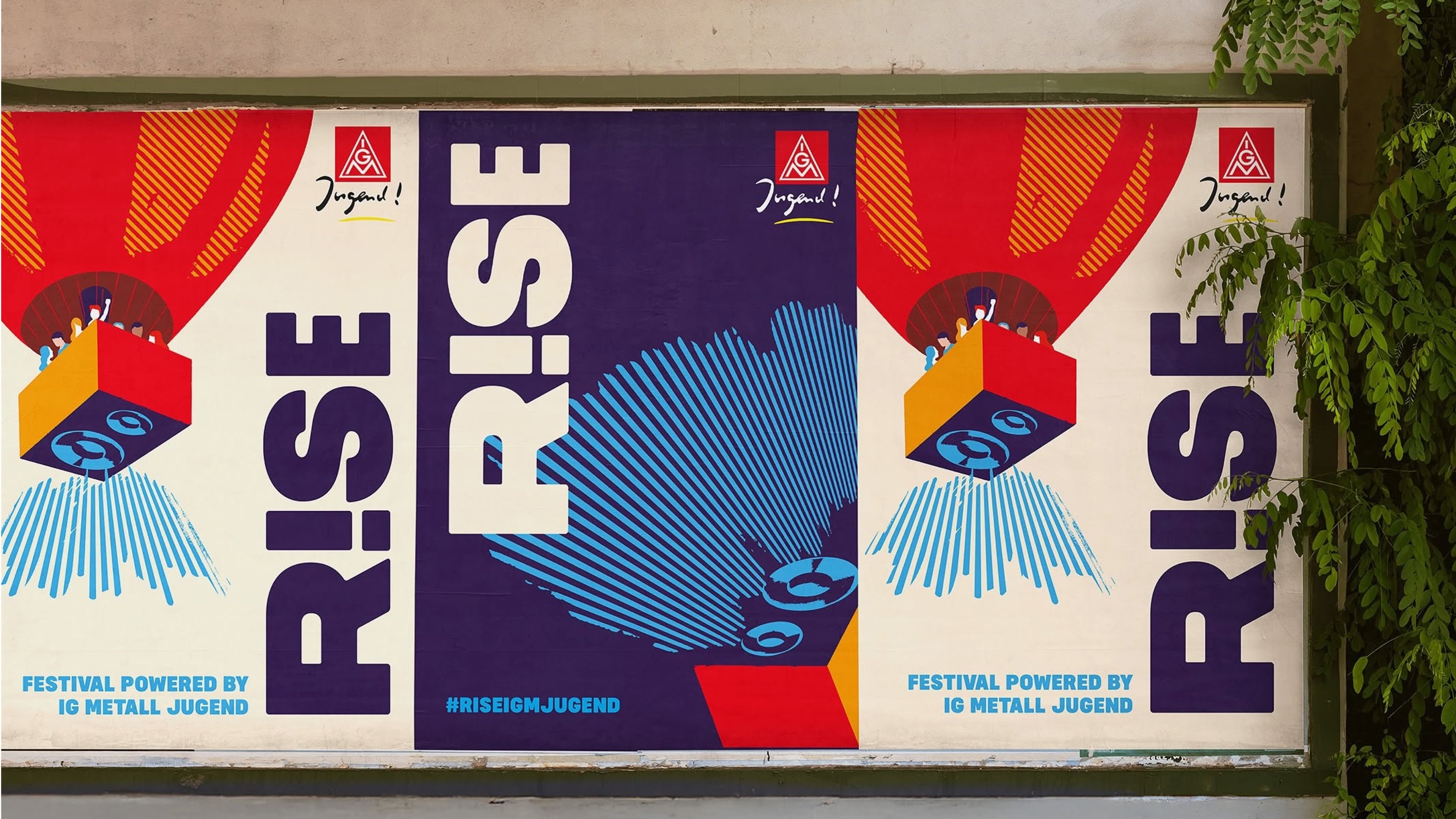
I developed the entire web concept, from the sitemap and user flows to how the content is distributed across the pages, and designed the website’s digital look and feel. I also built it myself in WordPress, set up so that the team can maintain the programme and content on their own, with my support. With motion and animation, I carried the dynamic character of the festival over to the website. The work built on the festival’s existing visual identity. A small selection of other festival media and merchandise is shown as well.
03Website
04Three phases
Before
Anticipation
Discover the programme, book tickets, sort out practical details.
During
Orientation
Assumption: the main use. On site, on phones: site map, programme, what’s on now.
After
Memories
Photo gallery and aftermovie to look back on the festival.
05UX decisions
What shaped the product
Before
Tickets and dates at the top
Ticket button, date, place and countdown at the top, below colour fields to programme, live acts and FAQ.
builds anticipation, shortens the way to buying a ticket
Always
Two goals in the menu
»Buy ticket« and »Become a member« in the menu on every page.
supports ticket sales and member recruitment on every page
Before and on site
The programme as a daily overview
The whole programme, live acts and workshops alike, as a daily overview with time, programme item and place.
visitors plan their festival day themselves, fewer questions on site
On site
Site map and signposts
An integrated site map and signposts.
find your way between stages and areas quickly
Operations
Maintained by the team
Built in WordPress.
programme changes go online at once, no waiting
Also: awareness content with direct contact to the awareness team, so help is quick to find.
These decisions are not backed by user testing. They are based on conversations with the client and on informed assumptions about the target groups’ needs.


06Measuring success
Primary metric · before the festival
Ticket conversion rate
How many visitors get from »Buy ticket« to a purchase in the ticket shop.
Hypothesis Visitors buy their ticket directly more often when the ticket button, date and place are visible without scrolling (above the fold).
On-site metric · festival weekend
Mobile usage
How often festival-goers check the programme and site map on their phones during the festival.
Hypothesis Festival-goers find their way around the grounds faster when the programme and site map are one tap away on their phones.
Planned, not yet implemented. How I would measure: set a baseline after launch, then compare every change against it.
07What I learned
Bring the site map closer
A festival is experienced mostly on phones. While mapping the user flow, I noticed that the site map can only be reached via the FAQ, two steps away. Today I would make it reachable directly from the home page and the programme, especially for the time on site.
08Style guide


09Outdoor & wayfinding
10Promotional items